Responsive Website Design: Why Every Business Needs a Mobile-Friendly Website
Today, customers use smartphones, tablets, laptops, and desktop computers to discover businesses, compare services, read reviews, and make purchasing decisions. If your website does not work properly on mobile devices, you may lose potential customers before they even learn what your business offers.
A mobile-friendly website is no longer just an optional feature. It is an essential part of building a professional online presence.
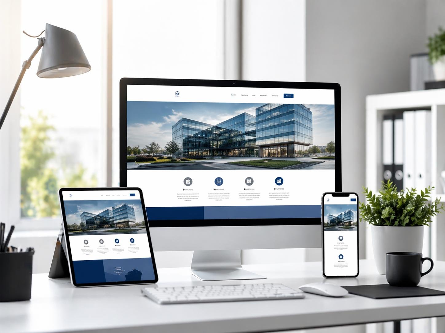
Responsive website design allows a website to adapt its layout, content, images, navigation, and other elements to different screen sizes. Whether a visitor opens your website on a small smartphone or a large desktop monitor, the goal is to provide a consistent, readable, and easy-to-use experience.
In this guide, we will explain what responsive web design is, why it matters for businesses, how it affects user experience and SEO, and what you should consider when developing or updating your website.
What Is Responsive Website Design?
Responsive website design is a web development approach in which a website automatically adjusts to the screen size and capabilities of the device being used.
Instead of creating separate websites for mobile and desktop users, a responsive website generally uses the same page URLs and content while adapting its layout to the available screen space.
For example:
-
On a desktop computer, a website may display a multi-column layout with a full navigation menu.
-
On a tablet, the layout may use fewer columns and more compact navigation.
-
On a smartphone, the same content may appear in a single column with larger buttons and a mobile-friendly menu.
Responsive design typically combines flexible layouts, CSS media queries, scalable images, and appropriately sized typography to create a better experience across devices.
The objective is simple: visitors should be able to access information and use your website without unnecessary zooming, horizontal scrolling, or difficulty navigating the page.
Why Does Every Business Need a Mobile-Friendly Website?
1. Reach Customers Across Different Devices
Your potential customers may discover your business through Google Search, social media, online advertisements, email campaigns, or direct recommendations. They may visit your website from almost any device.
If your website is designed only for desktop screens, mobile visitors may encounter tiny text, overlapping sections, cut-off images, or buttons that are difficult to tap.
A responsive website helps your business present its services, products, contact information, and other important details clearly across different devices.
For small businesses, startups, professional service providers, and established companies, this creates a more accessible online presence.
2. Improve User Experience
User experience plays an important role in how people interact with your website.
Imagine a potential customer visiting your website to learn about your services. If they have to zoom in to read the text, scroll sideways to view a pricing table, or struggle to complete a contact form, they may leave without contacting you.
A responsive website helps address these problems by adapting the layout to the visitor's screen.
Important improvements include:
-
Readable text without unnecessary zooming.
-
Navigation menus that work well on touchscreens.
-
Images that fit within the available screen width.
-
Forms with clearly labelled fields.
-
Buttons that are easy to identify and tap.
-
Content arranged in a logical order.
When visitors can find information quickly and complete tasks easily, your website becomes more useful and professional.
3. Support Your Search Engine Optimization (SEO)
Responsive web design can support your SEO strategy by providing a consistent website experience across devices.
Google primarily uses the mobile version of a website's content for indexing. Its documentation also recommends responsive design as an approach that is generally easier to implement and maintain than separate mobile URLs.
For businesses, this means your mobile website should contain the important information available on the desktop version, including service descriptions, headings, relevant images, metadata, and structured data where applicable.
However, responsive design alone does not guarantee higher Google rankings. Search visibility also depends on content quality, relevance, website performance, technical SEO, links, and many other factors.
To support SEO, make sure your responsive website has:
-
A clear heading structure.
-
Unique and descriptive page titles.
-
Relevant meta descriptions.
-
Crawlable links and accessible content.
-
Optimized images with meaningful alternative text.
-
A logical internal linking structure.
-
Consistent content across desktop and mobile layouts.
A mobile-friendly design is an important foundation, but it should work alongside a complete SEO strategy.
4. Create More Opportunities to Generate Leads
For many businesses, a website's primary purpose is to generate enquiries, phone calls, bookings, or sales.
Responsive design helps make these actions easier on mobile devices.
For example, a website development company can display its services, portfolio, and enquiry form in a layout that works comfortably on a smartphone. A local service provider can make its telephone number easy to find. An online store can present product details and purchasing controls clearly on smaller screens.
Consider optimizing your website's conversion elements:
-
Place a clear call to action near relevant content.
-
Make contact details easy to locate.
-
Keep enquiry forms short and straightforward.
-
Use sufficiently large buttons with descriptive labels.
-
Avoid intrusive pop-ups that obstruct the page.
-
Ensure forms provide helpful validation and confirmation messages.
These improvements do not guarantee more conversions, but they reduce unnecessary friction for potential customers.
5. Build Trust and Professional Credibility
Your website often forms part of a customer's first impression of your business.
A layout that breaks on mobile devices can make a business appear outdated or poorly maintained, even if its products and services are excellent.
In contrast, a well-designed responsive website communicates attention to detail and helps visitors interact with your business confidently.
A professional mobile experience should include consistent branding, readable content, clear navigation, working links, properly displayed images, and easy access to contact information.
Responsive design is not a substitute for good content or reliable service, but it supports a more polished overall presentation.
6. Make Website Maintenance Easier
Maintaining separate desktop and mobile websites can introduce additional work. Changes to content, navigation, features, and technical settings may need to be implemented in multiple places.
With a well-structured responsive website, businesses can generally manage one website with a shared set of URLs and content.
This can simplify routine updates such as:
-
Adding new service pages.
-
Updating business information.
-
Publishing blog articles.
-
Improving navigation.
-
Updating calls to action.
-
Maintaining consistent branding.
The actual maintenance effort depends on the website's architecture, CMS, integrations, and complexity. Responsive design makes a unified approach possible, but it does not eliminate ongoing maintenance.
Key Features of a Responsive Website
A website does not become fully responsive simply because it fits on a smartphone. Several design and development techniques work together to create a reliable experience.
1. Flexible Grid Layouts
Responsive layouts use flexible sizing rather than relying entirely on fixed-width sections.
For example, a desktop service page may display three service cards in a row, while the same cards stack vertically on a smartphone.
CSS Grid, Flexbox, percentages, and other flexible layout techniques help content fit the available space.
2. Mobile-Friendly Navigation
Navigation should help users reach important pages without unnecessary effort.
On smaller screens, a desktop navigation bar may become a collapsible menu. Menu items should remain readable, easy to tap, and logically organized.
Your most important pages, such as Home, About Us, Services, Portfolio, and Contact Us, should remain easy to find.
3. Responsive Images and Media
Large images can overflow a layout or consume unnecessary mobile data when they are not handled properly.
Responsive websites should display images within their containers and use appropriately sized image files. Where suitable, HTML features such as srcset and sizes allow browsers to select an image resource appropriate for the display.
Videos, embedded content, tables, and other media also need to fit smaller screens without breaking the layout.
4. Readable Typography
Text should be comfortable to read without forcing visitors to zoom in.
Use appropriate font sizes, line heights, spacing, and contrast. Relative units such as rem can help typography respond to user preferences and layout requirements.
Headings should establish a clear hierarchy, while paragraphs should avoid excessively long lines on large screens and cramped text on small ones.
5. Touch-Friendly Buttons and Forms
Smartphone users interact with websites using their fingers rather than a mouse.
Links and buttons should have enough space around them to reduce accidental taps. Forms should use clearly labelled fields, appropriate input types, and useful error messages.
For example, an enquiry form should make it easy to enter a name, email address, telephone number, and message without struggling with tiny controls.
6. Responsive Behavior at Different Breakpoints
CSS media queries allow developers to adjust layouts when the available screen space reaches a particular width or when device capabilities call for a different presentation.
Instead of designing for only a few popular phone models, developers should test how the content behaves across a range of viewport sizes.
The goal is for the design to adapt when the content needs a layout change, not merely to match the dimensions of one specific device.
How to Make Your Website Responsive
If you are building a new website or improving an existing one, follow these practical steps.
Step 1: Start With a Mobile-Friendly Layout
Plan how the most important content will appear on smaller screens before adding complex desktop layouts.
Identify the information users need most, such as service details, pricing, contact information, and primary calls to action.
A mobile-first approach can help prioritize essential content and avoid unnecessary design complexity.
Step 2: Add the Viewport Meta Tag
A responsive website should normally include the following tag in its HTML document's <head> section:
<meta name="viewport" content="width=device-width, initial-scale=1">
This tells the browser to match the layout viewport to the device width and establish the initial scale appropriately.
Without a suitable viewport configuration, mobile browsers may render a page using a wider virtual layout, making text and controls appear too small.
Step 3: Use Flexible CSS
Avoid depending on fixed widths that are larger than a phone's viewport.
For example, this basic CSS helps prevent images from extending beyond their containers:
img,
video {
    max-width: 100%;
    height: auto;
}
For a more complete layout, use CSS Grid or Flexbox, sensible maximum widths, flexible spacing, and media queries where the design requires them.
These are starting points rather than a complete responsive stylesheet. Existing styles may need adjustments to prevent overflowing elements and unintended layout changes.
Step 4: Optimize Navigation and Forms
Review your navigation menu, search controls, enquiry forms, and other interactive elements.
Make sure the mobile menu opens and closes correctly, buttons remain accessible, and form fields do not extend beyond the screen.
Test error messages, successful submissions, and any third-party form integrations on real mobile devices where possible.
Step 5: Optimize Images and Website Performance
Responsive design and website speed should be considered together.
Compress images, choose appropriate file formats, avoid loading unnecessarily large assets, and review the JavaScript and CSS used on each page.
A responsive website can still be slow if it downloads oversized images, runs excessive scripts, or relies on an overloaded server.
For a deeper look at performance improvements, read our upcoming guide: Website Speed Optimization: A Complete Guide to Faster Websites.
Step 6: Test Across Screen Sizes
Check the website at narrow, medium, and wide viewport widths.
Test the pages that matter most to your business, including the homepage, service pages, portfolio, blog articles, and contact form.
Look for:
-
Horizontal scrolling.
-
Overlapping headings and buttons.
-
Navigation that does not work.
-
Images that appear stretched or cropped incorrectly.
-
Text that is difficult to read.
-
Forms that are hard to complete.
-
Missing content or broken interactive elements.
Browser developer tools are useful for initial checks, but testing on actual phones and tablets can reveal issues that an emulator may not show.
Common Responsive Web Design Mistakes to Avoid
Even websites described as mobile-friendly can have problems that affect usability.
Hiding important content on mobile: Do not remove essential service details or other useful information simply to shorten the mobile page. Organize content thoughtfully instead.
Using fixed-width elements: Wide tables, banners, images, and embedded widgets can create horizontal scrolling. Make sure these elements adapt or provide an appropriate mobile presentation.
Making buttons too small: Small or closely spaced controls can lead to accidental taps and frustration.
Ignoring website speed: A layout may fit perfectly on a phone but still offer a poor experience if it loads slowly.
Overusing pop-ups: Pop-ups that cover the main content can make it difficult for mobile visitors to read or navigate the website.
Testing only the homepage: Every important page template should be tested, including service details, blog pages, forms, and any checkout or booking flows.
Treating responsiveness as a one-time task: New content, plugins, scripts, and design changes can introduce layout problems. Recheck responsive behavior after significant updates.
Responsive Website Design and Mobile SEO: What Businesses Should Know
A responsive website provides a useful technical foundation for mobile SEO, but a successful strategy requires more than adapting the layout.
Google's mobile-first indexing approach means that the mobile version of your content is especially important. If important text, images, metadata, or structured data are missing from the mobile experience, search engines may not receive the same information that desktop visitors see.
Businesses should therefore check that:
-
Important content is available on mobile.
-
Page titles and meta descriptions are appropriately maintained.
-
Internal links work correctly.
-
Images have meaningful alternative text where appropriate.
-
Search engines can crawl necessary resources.
-
Pages do not require user interaction before essential content becomes available.
-
The website provides a usable experience at different screen sizes.
Use Google Search Console to monitor indexing and search visibility, and use PageSpeed Insights to evaluate performance and identify opportunities for improvement.
Remember that mobile-friendliness, performance, and content relevance are related but distinct considerations. Improving one area does not automatically solve problems in the others.
How to Choose a Responsive Website Development Company
If you are hiring a developer or agency to build a website, ask how responsive behavior will be planned, implemented, and tested.
A reliable development process should cover:
-
Requirements: Identify your business goals, target customers, important pages, and required features.
-
Design: Plan layouts for different screen sizes instead of treating mobile as an afterthought.
-
Development: Use maintainable HTML, CSS, and JavaScript practices that support responsive behavior.
-
Performance: Consider image sizes, loading behavior, scripts, and hosting.
-
Testing: Check navigation, forms, links, content, and layouts across different viewport sizes.
-
Launch and maintenance: Fix issues discovered after launch and review the site when content or features change.
Ask to see examples of previously developed websites on both mobile and desktop screens. Also clarify what is included in the project, whether content updates are covered, and what ongoing maintenance may cost.
Choosing a developer based on the lowest initial price alone may not be the best decision. A suitable solution should meet your business needs, remain maintainable, and provide a reliable experience for your customers.
Conclusion
Responsive website design helps businesses deliver a consistent and usable online experience across smartphones, tablets, laptops, and desktop computers. It can improve accessibility, make navigation easier, support lead generation, simplify website management, and provide a strong foundation for mobile SEO.
However, responsiveness should be combined with fast loading times, useful content, accessible interactions, clear calls to action, and regular testing.
Whether you are launching a new business website or updating an existing one, investing in responsive design helps ensure that visitors can understand your services and interact with your business on the devices they already use.
Need a responsive website for your business?
India Technology Solutions provides website design and development services to help businesses establish a professional online presence. If you are planning a new website or want to improve your existing one, explore our Website Design and Development Services and contact us to discuss your requirements.
Frequently Asked Questions (FAQs)
1. What is responsive website design?
Responsive website design is an approach that allows a website's layout and content to adapt to different screen sizes and device capabilities. It helps visitors use the website without unnecessary zooming or horizontal scrolling.
2. Why is a mobile-friendly website important for a business?
A mobile-friendly website makes it easier for customers to explore services, read information, contact a business, and complete actions on smartphones and tablets. It also supports a more consistent brand experience.
3. Does responsive website design improve SEO?
Responsive design can support mobile SEO by providing consistent content and URLs across devices. However, it does not guarantee higher rankings. Search visibility also depends on content quality, technical SEO, performance, relevance, and other factors.
4. Is responsive design suitable for small businesses?
Yes. Responsive design is suitable for small businesses, startups, service providers, and larger organizations. It helps a business serve visitors using different devices without necessarily maintaining separate desktop and mobile websites.
5. How much does responsive website development cost in India?
The cost depends on the website's size, design requirements, functionality, content, integrations, and maintenance needs. A simple business website generally costs less than a custom website with advanced features. Ask developers for a written estimate based on your specific requirements rather than relying on a single standard price.
6. How can I check whether my website is responsive?
Open your website at different browser widths, use your browser's responsive design tools, and test it on real mobile devices. Check navigation, text, images, buttons, forms, and horizontal scrolling. You can also use Google's PageSpeed Insights to review performance and identify potential issues.
7. What is the difference between responsive design and mobile-first design?
Responsive design describes how a layout adapts to different screen sizes. Mobile-first design is a development approach in which the initial design prioritizes smaller screens before being expanded for larger devices. The two approaches can be used together.
8. Can an existing website be made responsive?
In many cases, yes. Developers can update the existing HTML, CSS, layout, images, navigation, and interactive elements. However, if the website uses an outdated template or complex legacy code, a partial or complete redesign may be more practical.